[
Date Prev][
Date Next][
Thread Prev][
Thread Next][
Date Index][
Thread Index]
[
List Home]
|
Re: [platform-ui-dev] Stacked Views/CTabFolder mockup (nt)
|
(See attached file: mockup2.gif)
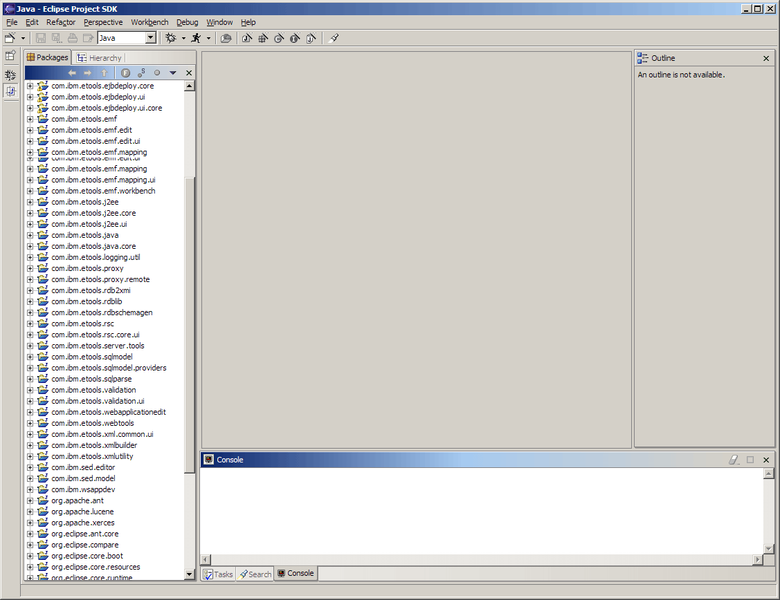
I have extended the separator to form "tabs", and removed the faded
gradient behind the active packages tab.
|---------+--------------------------------->
| | knut_radloff@xxxxxxx |
| | Sent by: |
| | platform-ui-dev-admin@|
| | eclipse.org |
| | |
| | |
| | 02/12/2002 12:48 PM |
| | Please respond to |
| | platform-ui-dev |
| | |
|---------+--------------------------------->
>-------------------------------------------------------------------------------------------------------------------------------------|
| |
| To: platform-ui-dev@xxxxxxxxxxx |
| cc: |
| Subject: Re: [platform-ui-dev] Stacked Views/CTabFolder mockup (nt) |
| |
| |
>-------------------------------------------------------------------------------------------------------------------------------------|
In my opinion, the console tabs you made up are a big improvement over the
existing look. The active tab stands out much better than they do now.
I would still like the inactive tabs to look more like tabs and not a
series of icons/labels. I think all you need to do to achieve this is
connect the vertical floating line to the outside (lower) horizontal tab
border and maybe extend it to the other side a little more as well.
As for the package/hierarchy view tab, the blueish ("steel") color looks
cheesy and makes the label hard to read. It should probably look like the
console tabs. I'm guessing that the contrast with the blue title bar was
too harsh. If someone doesn't like that they just have to put the tabs at
the bottom.
BTW: The bug that is addressed by the tab mockup is
http://bugs.eclipse.org/bugs/show_bug.cgi?id=5478
KnutAttachment:
mockup2.gif
Description: GIF image