Dear team,
Really like how the logos turn out. Couldn’t agree more with the difference made between ospo zone and alliance, it was confusing at
first.
Best,
Philippe
De : ospo.zone <ospo.zone-bounces@xxxxxxxxxxx>
De la part de Gilles Gravier
Envoyé : vendredi 25 novembre 2022 09:48
À : OSPO community discussions <ospo.zone@xxxxxxxxxxx>
Objet : Re: [ospo.zone] New logo feedback (for validation next monday)
|
* Ce message a ete emis par un expediteur externe *
Prenez garde aux liens et aux pieces jointes. Ne fournissez jamais votre mot de passe de connexion Ville de Paris.
|
Hello!
I like the logo. The additional red square on the bottom line means that it's for specific projects? So all "projects" will have that additional red square? Gives it a nice
coherent and structured look.
![]() ᐧ ᐧ
Dear OSPO Alliance community,
Please find attached the latest proposition from the communication Task Force about the new logo and its variations for projects. Here is the main directives that guided the
task force
-
The brand is clearly "OSPO Alliance". Our current members joined the OSPO Alliance and not a platform (aka ospo.zone).
-
Therefore, the logo should read Ospo Alliance and not OSPO Zone. Ospo Zone will only be the website URL.
-
Start with the current logo, keeping the squares and colors, Do not reinvent the look'n feel.
-
The logo should
-
have a square version for social media avatar
-
be declined for the OSPO Alliance projects
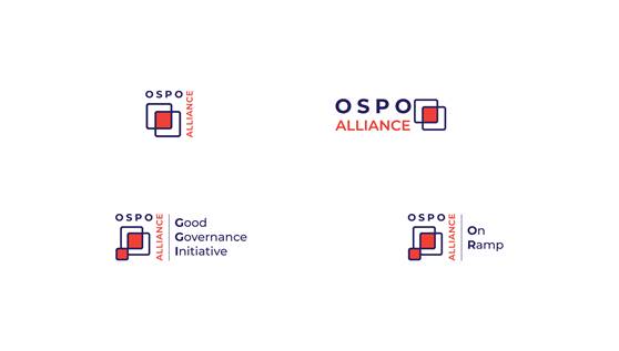
First line is the regular logo (the rectangular one on the right) and its squared version on the left.
On the second line you'll find the variations for the projects
The objective is to get your feedback ASAP so we can validate the new logo during our next regular Monday community meeting and then deploy it to the website and future communication
material.
_______________________________________________
ospo.zone mailing list
ospo.zone@xxxxxxxxxxx
To unsubscribe from this list, visit
https://accounts.eclipse.org
--
|