[
Date Prev][
Date Next][
Thread Prev][
Thread Next][
Date Index][
Thread Index]
[
List Home]
|
[soc-dev] [gsoc] Rich Data Visualization
|
Hello,
tracks how developers use their Eclipse IDE. If you ever wanted to find out how you use code completions or what commands you use most often, Developer Statistics has the answer. The goal of this project is to develop a rich visualization of the data collected, to enable the developer to drill down and find out how to make more efficient use of the Eclipse IDE's features. The already collected data could now be evaluated and displayed graphically in the form of diagrams. What I have done this week: Last week I have tried to add BIRT charts in native SWT/JFace dialogs. A first Proof-of-Concept you can see here:
|
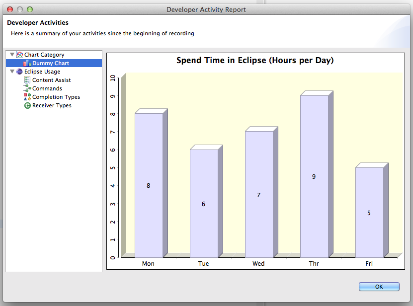
This current screenshot is only a prototype with dummy data. With this prototype I have learned, how I have to integrate charts in SWT. Code for this diagram you can see in the attachment.
Tasks for the next week: For the next week we have the goal to create two pie charts, as a result for the mid term evaluation. One for the concluded / aborted code completions and another one for code completion types, see task 437631.
Feedback: If you want to install Developer Statistics, look at the update site [1]. Feedback would be really great, please comment on bug 431842 or contact me on the mailing list. Regards, Akif
|
Attachment:
BirtDummyChart.java
Description: Binary data