Mickael,
Firstly let me thank you for the effort invested in these
changes. Don't take critique as a sign of ungratefulness.
Without creative people like you to take action there would be no
progress. Unfortunately it's also the case that no good deed goes
unpunished...
I read the whole Bugzilla, but I see no mention of a decision to
use "Find Actions" and hence no underlying thought process for why
this specific wording was chosen. I did see mention of "most
customers don't know what Quick Access does". But some do
apparently. We don't really have any concrete data as a basis for
making a statistically-based argument one way or the other. So
whether "Find Actions" as a label will help customers find it this
useful control and will also help them understand that by
"Actions" this really means that they can quickly find shortcuts
to "Open" Views, "Open" Perspectives, "Invoke/Run/Execute/Perform"
Commands, "Do Something With with" Menus (though I wonder how is
that different conceptually from a Command?), "Create a" New
"Something", "Open" Preferences, and maybe more eventually? Will
that be more helped customers than the ones who wonder where Quick
Access has gone? Perhaps? Probably? No doubt way more customers
will be helped?
Let's assume that this new UI design will help more people find
this useful feature than it will hinder people looking for the
familiar "Quick Access" because the replacement UI appears in
exactly the same place as before. It certainly seems a
reasonable assumption. Maybe almost everyone uses Ctrl-3 away and
won't care one way or the other.
But is "Find Actions" the ideal term to use here? I know you
can Find things this way, and I suppose whatever you do with that
thing you find is an action...
Also, the +/+ with the wand icon looks quite a bit like the +
used for creating new things and it's hard to see that there is a
flashlight on the end of the wand. Maybe someone graphically
creative could make an even better icon? I.e., one so pretty,
meaningful, and attention grabbing that it screams "Click me, I'm
awesomely useful!". Then we might not need any text and we'll
make the screen-wastage-averse users even happier. (One might even
consider whether the toolbar could now be made even more compact
in terms of height.)
Should these be discussed on this already-fixed Bugzilla or on
some other existing/new dedicated Bugzilla?
Thanks,
Ed
On 28.09.2019 07:46, Mickael Istria
wrote:
But I wonder why the change of
wording from "Quick Access", which is very general, to
"Find Actions", which is more specific than what the
button actually does? Note only that, use the button and
type "x":
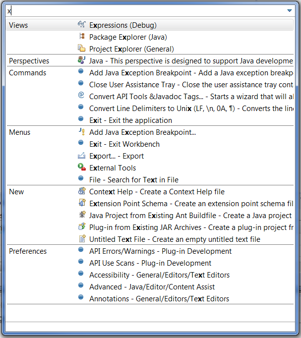
I don't see any "Actions". I'm also concern that our
large user base is likely to not recognize this as a
new, improved "Quick Access" replacement.
https://bugs.eclipse.org/bugs/show_bug.cgi?id=550932
_______________________________________________
cross-project-issues-dev mailing list
cross-project-issues-dev@xxxxxxxxxxx
To change your delivery options, retrieve your password, or unsubscribe from this list, visit
https://www.eclipse.org/mailman/listinfo/cross-project-issues-dev