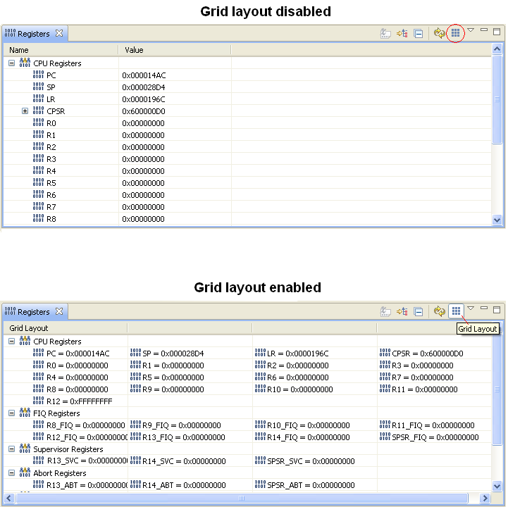
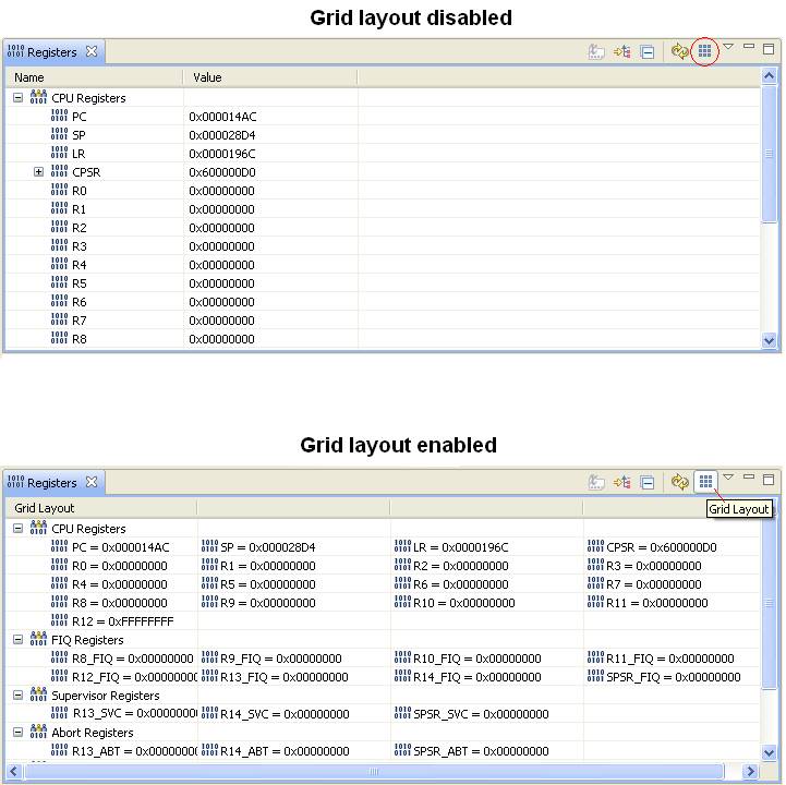
One of the features
requested from our users is to display
registers in a grid layout. This would allow users to look at more
registers as they’re debugging their code. This feature makes a
much better use of the empty space typically displayed in Registers
view.
As indicated in the attached snapshot, the captured registers view
displays
about 13 registers when it’s in “tree layout”. However,
switching to “grid layout” allows the user to view more than 30
registers at the same time.
I’ve already implemented
this feature without
modifying Platform/CDT code. When grid layout is selected, I replace
the
content/label providers used by the tree viewer in Registers view. The
current
TreeModelViewer and label provider used by Registers view automatically
assume
that each register will be displayed on a new row. By replacing the
providers, I “trick” the viewer into displaying multiple registers
on the same row. My solution is not very clean or efficient. To come
up with a better solution, I’d have to implement it at a lower level
(i.e. either at platform or CDT/DSF layer).
The purpose of this
e-mail is to see who else in the
community would be interested in such a feature. If there is enough
interest, I can submit an enhancement (along with my code) and with the
help of
the community we can come up with the ideal solution.
Regards,
- Navid