Darkest Dark Theme for a Total Eclipse
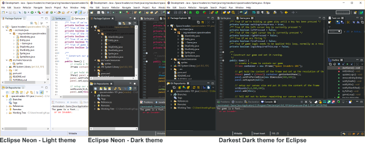
Great news! That modern dark UI you always wished the Eclipse IDE had is available for free, right now. We are pleased to introduce the recently released Darkest Dark theme for the Eclipse IDE. This is a fresh new theme designed from the ground up to give you the sharpest contrast and a new set of flat, high-contrast icons.
Check out the level of change, from brightest day to darkest dark night, below:
Want to give it a try? Get the Darkest Dark theme from the Eclipse Marketplace for free.
In a moment, we'll cover a bit of how we built this slick plugin, but first, we need to ask you for a bit of help so we can ensure that every Eclipse plugin looks amazing.
Here's the problem, there are just a lot of plugins out there and we all use different sets! So, once you install Darkest Dark, if you see something that is really funky looking, please take a moment to add an entry in our Theme Problems forum. We're targeting first the more popular plugins and places where things are just flat broken. These are things like really bad icons, or poor color choices which we can normally address very quickly if the path to reproduction is simple. Darkest Dark uses our evergreen update technology so as soon as we fix a couple of items you'll automatically get all the updates pushed into your installations so you're never out of date. Thanks in advance -- we really appreciate it!
So, how did we make this?
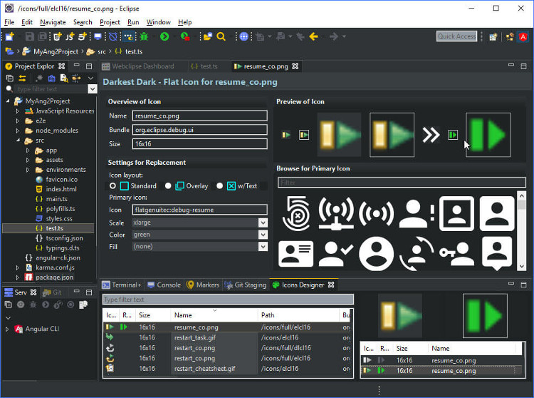
It was actually very hard, because it isn't really a theme. It just plays one in your Eclipse installation. Creating the Darkest Dark theme required not only using E4 styling but also creative usage of OSGi to intercept low-level calls. Our code intercepts the original icon load for something like the toolbar and returns an on-the-fly generated replacement icon. This gives the benefit of avoiding loading the original icon as well as ensuring full HiDPI support. Of course, it also provides the flexibility to tweak the colors of icons without rebuilding any images.
Where things get even hairier this how developers across the plugin community have used different patterns in building their slick UIs. For instance, there are visual designers that let people drag items together which use a combination of default colors from the theme and hardcoded colors like a bright yellow. Or other plugins where developers were using custom colors in the background of the table which contrasted on dark. In these examples, we have to intercept color load and have to return back an alternate color.
Whats up next?
To help us in making the replacement icons, we put together a cool Icon Editor which lets you see all of the icons that have been loaded in the Eclipse IDE including frequency of use, and create a replacement for the image. Even cooler is that when you save the updated icon, it is live-replaced into your running Eclipse IDE for many controls. I believe right now we are just missing a couple places like replacing loaded images in Image Registry caches. You can even click control-shift with your mouse over an item to find the source image. With this technology, we'll be allowing you and the community to suggest replacement icons for plugins we've missed and we'll do a light weight moderation before releasing them back to the community!
We hope you enjoy using the darkest dark theme and that you'll forgive if there are still a couple rough edges as this multi-engineer multi-month project has been a tough one. It was certainly a much larger undertaking than what we anticipated when we first started, but that turned into a benefit because if we'd known the true level of effort our management team might not have approved it!
We want to thank a few projects in particular for helping make this possible. First and foremost is Equinox and OSGi for providing the foundation that makes these creative engineering solutions possible in the first place. The Eclipse Color Theme plugin is included as part of the Darkest Dark theme to provide configurable editor colors. Work by the Eclipse platform team in Oxygen is brought forward to help clean up a couple rough areas like Button and Table header coloring on Windows. Finally, Code Affine did some nice work with flat scrollbars that provided a base to rid the UI of those nasty Windows scrollbars.
In closing I just want to point out that the Darkest Dark theme isn't just free to use, we've also made it free to redistribute. So if you have any products you've built on the Eclipse platform, you may freely include Darkest Dark to deliver a rich modern dark UX to your users.
About the Author


