Styling
Every layer that has effect on visualization has it's own style configuration. For example, the SelectionLayer has it's own style configuration telling how to render selected cells, the ColumnHeaderLayer has it's own style configuration telling how to render the column header cells, while the NatTable itself knows the style configuration on how to render all other cells (mainly the cells in the body region of a grid). To customize the visualization of the NatTable you have to override and register your own style configuration on the specific layer itself.
Style
The styling is configured by creating and registering Style objects. There are several ConfigAttributes that can be set to define a Style:
- BACKGROUND_COLOR
- FOREGROUND_COLOR
- HORIZONTAL_ALIGNMENT
- VERTICAL_ALIGNMENT
- FONT
- BORDER_STYLE
- IMAGE (only used by the ImagePainter)
- GRADIENT_BACKGROUND_COLOR (only used by the GradientBackgroundPainter)
- GRADIENT_FOREGROUND_COLOR (only used by the GradientBackgroundPainter)
- PASSWORD_ECHO_CHAR (only used by the PasswordTextPainter and PasswordCellEditor)
Theses ConfigAttributes are defined in the CellStyleAttributes interface and can be used like this:
Snippet from DefaultNatTableStyleConfiguration
Cell painters
NatTable user cell painters to paint each cell. These painters implement the ICellPainter interface. The default painter is the TextPainter. NatTable comes with a bunch of painters that can be used and mixed so the NatTable gets painted the way you want.
CellPainterWrapper
Paints the interior of the cell using a given painter. It then goes on put some decorations around/behind the cell.
Implementing classes are:
- TextPainter - paints its content as text
- VerticalTextPainter - paints its content as text vertically
- PasswordTextPainter - specialized TextPainter that paints echo chars for every character
- LineBorderDecorator - paints a border around the cell
- PaddingDecorator - puts a padding around the cell contents
- BeveledBorderDecorator - Gives the cell a button like look by drawing a beveled border
- ImagePainter - Paints an image into the cell.
- BackgroundImagePainter - Paints the background of the cell it wraps using the given image
- GradientBackgroundPainter - Paints the background of a cell in a gradient way.
You can mix and match the above painters to create your own variations without needing to write much code.
For example the following snippet
Snippet from StyledColumnHeaderConfiguration of StyledGridExample
will paint something like this

TextPainter
As the name suggests, it paints its content as text and reads the relevant style attributes out of the ConfigRegistry.
It takes into account font, colors and alignment when it paints. There are several constructors that allow modifications to the default behaviour.
So it is possible to tell the TextPainter to wrap the text, paint the background, add spacing and/or calculate the cell
size (row height, column width) dependent on the text that should be rendered.
Since the Nebula NatTable release 0.9.0 you can also configure the TextPainter to render text underlined
and/or strikethrough.
All of the listed configurations to the TextPainter also apply to the VerticalTextPainter. To get familiar with the various possibilities of TextPainter configuration, you should have a look at the TextPainter_Examples.
ImagePainter
The ImagePainter can be used to render an image to a cell. There are two ways to configure it:
- constructor - the ImagePainter is created with an image and will only render this image.
- style configuration - the ImagePainter is created with no image, so on rendering it checks the style configuration for the IMAGE attribute to know which image to render
CellPainterDecorator
Paints using a base painter and then decorates it using a second painter. For example, in the following snippet
Snippet from the ButtonCellExample
will paint something like this

Using a custom cell painter
In order to use a custom cell painter you need to:
- Create a custom implementation of the ICellPainter. Normally you would be able to reuse one of the existing ones.
- Apply a custom label to the cells which should use your painter.
- Register your painter in the config registry against the cell labels you applied in step 2. Custom painters are registered as CellConfigAttributes.CELL_PAINTER attributes.
The PercentageBarExample shows how to use the PercentageBarCellPainter instead of the TextPainter in the body region of the grid. This is done by registering the new painter as shown the following snippet
Snippet from the PercentageBarExample
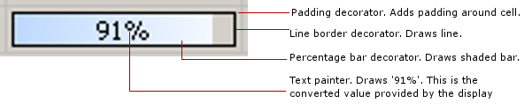
The painter itself looks like this
The diagram below illustrates the various parts of the cell these painters paint
Conditional styling
NatTable supports conditional configurations by using labels. This way it is also possible to add conditional styling. To use conditional styling the first step is to register a label to a cell. You can do this by using a IConfigLabelAccumulator. There are several predefined implementations like
- CellOverrideLabelAccumulator - register a label to a specific cell value
- ColumnOverrideLabelAccumulator - register a label to all cells of a specific column
- RowOverrideLabelAccumulator - register a label to all cells of a specific column
These implementations extend AbstractOverrider which gives the opportunity to register labels to certain conditions like a special value, column or row index.
Snippet from CellConfigurationExample
If you need a more specific labeling mechanism you can implement IConfigLabelAccumulator and put your conditional logic into accumulateConfigLabels(). Within this method you have to add your custom label to the given LabelStack if your condition matches.
For example, if you have a NatTable that shows persons and you want to render rows that show females differently you can implement it like this:
Note that your IConfigLabelAccumulator needs to know the IDataProvider to make this work.
To enable conditional styling, the custom style needs to be registered in the IConfigRegistry against the label defined before.
Snippet from CellConfigurationExample
