Eclipse Picasso: A free open-source visualizer for Convolutional Neural Networks
Cloudy with a chance of tanks
While it’s easier than ever to define and train deep neural networks (DNNs), understanding the learning process remains somewhat opaque. Monitoring the loss or classification error during training won’t always prevent your model from learning the wrong thing or learning a proxy for your intended classification task. To understand what we mean, consider this (possibly apocryphal) story [1]:
Once upon a time, the US Army wanted to use neural networks to automatically detect camouflaged enemy tanks. The researchers trained a neural net on 50 photos of camouflaged tanks in trees, and 50 photos of trees without tanks…
Wisely, the researchers had originally taken 200 photos, 100 photos of tanks and 100 photos of trees. They had used only 50 of each for the training set. The researchers ran the neural network on the remaining 100 photos, and without further training the neural network classified all remaining photos correctly. Success confirmed! The researchers handed the finished work to the Pentagon, which soon handed it back, complaining that in their own tests the neural network did no better than chance at discriminating photos.
It turned out that in the researchers’ dataset, photos of camouflaged tanks had been taken on cloudy days, while photos of plain forest had been taken on sunny days. The neural network had learned to distinguish cloudy days from sunny days, instead of distinguishing camouflaged tanks from empty forest.
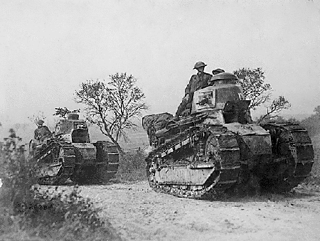
Definitely a real image of a modern tank from the training set. Source: Wikipedia
Regardless of the veracity of this tale, the point is familiar to machine learning researchers: training metrics don’t always tell the whole story. And the stakes are higher than ever before: for rising applications of deep learning like autonomous vehicles, these kinds of training errors can be deadly [2].
Fortunately, standard visualizations like partial occlusion [3] and saliency maps [4] provide a sanity check on the learning process. Toolkits [5] for standard neural network visualizations exist, along with tools for monitoring the training process. They’re often tied to the deep learning framework, if not model-specific. Could a general, easy-to-setup tool for generating standard visualizations have saved these researchers from detecting sunny days instead of tanks?
Eclipse Picasso
Eclipse Picasso is a free open-source (Eclipse Public License (EPL)) DNN visualization tool that gives you partial occlusion and saliency maps with minimal fuss. At Merantix, we work with a variety of neural network architectures; we developed Picasso to make it easy to see standard visualizations across our models in our various verticals: including applications in automotive, such as understanding when road segmentation or object detection fail; advertisement, such as understanding why certain creatives receive higher click-through rates; and medical imaging, such as analyzing what regions in a CT or X-ray image contain irregularities.
Picasso is a Flask application that glues together a deep-learning framework with a set of default and user-defined visualizations. You can use the built-in visualizations and easily add your own. Picasso was developed to work with checkpointed Keras and Tensorflow neural networks. If you want to try it out but don’t have any trained models, we provide Tensorflow and Keras MNIST checkpoints and a Keras VGG16 checkpoint for you.
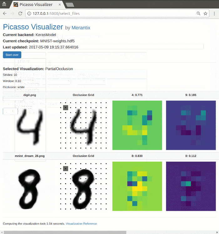
An overview of the application flow with the default settings. The user has loaded a Keras model trained on the MNIST dataset, and generates a partial occlusion visualization on a couple handwritten digit images. See below for an in-depth explanation of occlusion maps.
At Merantix, we are particularly interested in convolutional neural networks (CNNs) that take images as inputs and do classification. We developed Picasso with these parameters in mind. However, the framework is flexible enough to use on all kinds of models. While the included visualizations should be fairly robust across different NNs, you can still implement model-specific visualizations if you want to.
We provide a few standard visualizations out of the box:
- Partial occlusion - Occlude parts of the image and see how the classification changes.
- Saliency map - Compute derivatives of class predictions with respect to the input image.
- Class Prediction - Not a visualization per se, but can be a handy, simple check on the learning process.
And we have a couple more in the works! For a more in-depth exposition, see our paper on arXiv.
Picasso in practice
Let’s attack the tank problem with Picasso’s two builtin visualizations: partial occlusion and saliency maps. In these examples, we’ll used a pre-trained VGG16 model for classification. We already know this model is pretty good at classifying tanks: can we use these visualizations to check that model is actually classifying based on the tank and not, say, the sky?
By sequentially blocking out parts of the image, we can tell which regions are more important to classification. This image was classified by the VGG16 model, with a 94% classification probability of “tank.” Bright parts of the image correspond to higher probability of the given classification. For instance, the sky regions are very bright because occluding the sky doesn’t affect the probability of this image being classified as a tank. And conversely, the tank tread regions are darker because without them, it’s hard to for the model to know if it’s looking at a tank.
We can see how this visualization may have helped the Army: it’s clear that when the “tanky” parts are missing (for instance, the tank treads), the model can’t successfully classify it. Interestingly, when you block some of the tread, there’s a higher probability of classifying the image as a half-track. This intuitively makes sense, because a half-track has regular wheels in the front.

The model is quite sure this is a half-track — unless you block out the wheels! It’s also quite sure it’s not a tank; that is, unless you occlude the wheels. Image source: Wikipedia
In addition to partial occlusions, we also provide saliency maps out-of-the-box. Saliency maps look at the derivative of the input image (via backpropagation) with respect to classification. A high value at a given pixel means changing this pixel should more dramatically affect the classification.
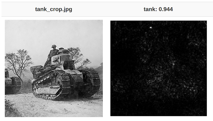
Saliency map for the tank. Brighter pixels indicate higher values for the derivative of “tank” with respect to that input pixel for this image. The brightest pixels appear to be in the tank region of the image, which is a good sign. Notice that with a few exceptions, the non-tank areas are largely dark — meaning changing these pixels should not make the image more or less “tanky.”
Adding visualizations
We wanted it to be particularly easy to integrate new visualizations. All you need to do is drop your visualization code in the visualizations folder and cook up an HTML template to display it.
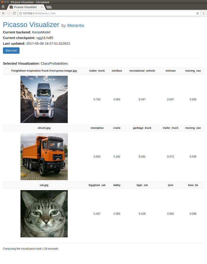
See the tutorial on the ClassProbabilites visualization for an example on how to build very simple visualization.
Giving the relative classification probabilities is about the simplest visualization you can make.
Using your own Models
Naturally, you’ll want to use the included visualizations with your own trained neural networks. We’ve tried to make this as simple as possible, but at the minimum you’ll need to define three methods:
preprocesstell the visualization how to change uploaded images into NN inputspostprocesstell the visualization how to change flattened intermediate layers to the image dimensions (this is needed by visualizations which operate on intermediate layers, like saliency maps)decode_probtell the visualization how to interpret the raw output, usually an array of probabilities, by annotating with class names
How to construct these functions is detailed in this tutorial. These functions can be specified separately from the source code for the app.
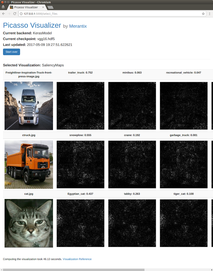
The results for a saliency map visualization. The app is using the Keras framework with a VGG16 model. This example comes prepackaged with the code. Since saliency maps depend on the derivative of the input layers with respect to an intermediate layer, you must tell the visualization how to reshape the output tensor back into an image with `decode_prob`.
Contributing
We’re very open to suggestions about how better to structure our application. And if you’d like to contribute a visualization or anything else, even better! Head over to our GitHub repository for more. We’re releasing Picasso under the EPL because we intend for it to become part of the Eclipse Foundation.
Acknowledgements
- Elias and Filippo for early code contributions and finding bugs and issues.
- John, Josh, Rasmus, and Stefan for their careful code review and feedback on this article.
- David and Nader for reviewing and discussion of this article.
References
- Yudkowsky, Eliezer. “Artificial Intelligence as a Positive and Negative Factor in Global Risk.” Global Catastrophic Risks, edited by Nick Bostrom and Milan M. Ćirković, 308–345. New York: Oxford University Press. 2008.
- “Tesla Driver Killed In Crash With Autopilot Active, NHTSA Investigating”. The Verge. N.p., 2017. Web. 11 May 2017.
- Zeiler, Matthew D., and Rob Fergus. “Visualizing and understanding convolutional networks.” European conference on computer vision. Springer International Publishing, 2014.
- Simonyan, Karen, Andrea Vedaldi, and Andrew Zisserman. “Deep inside convolutional networks: Visualising image classification models and saliency maps.” ICLR Workshop, 2014.
- Yosinski, Jason, et al. “Understanding neural networks through deep visualization.” Deep Learning Workshop, International Conference on Machine Learning (ICML), 2015.
About the Author


