Dark Theme in Eclipse Photon
A few years ago, in 2014, Eclipse IDE announced that it will ship a default dark theme. In 2014, many of restrictions existed in the CSS and SWT styling of the Eclipse workspace and the result was not very usable. But the Eclipse platform team wanted to lay the foundation for improvements without the requirement to install external components to test and to drive these improvements. The releases following the initial release constantly improved the capabilities of the underlying CSS engine and the SWT toolkit to enhance the user experience.
With Eclipse Photon, we are shipping the best support for the dark theme so far. Continue to read to learn about the improvements in the platform and in the second part, how plug-in developers can enable their Eclipse contributions for the dark theme.
Try it out
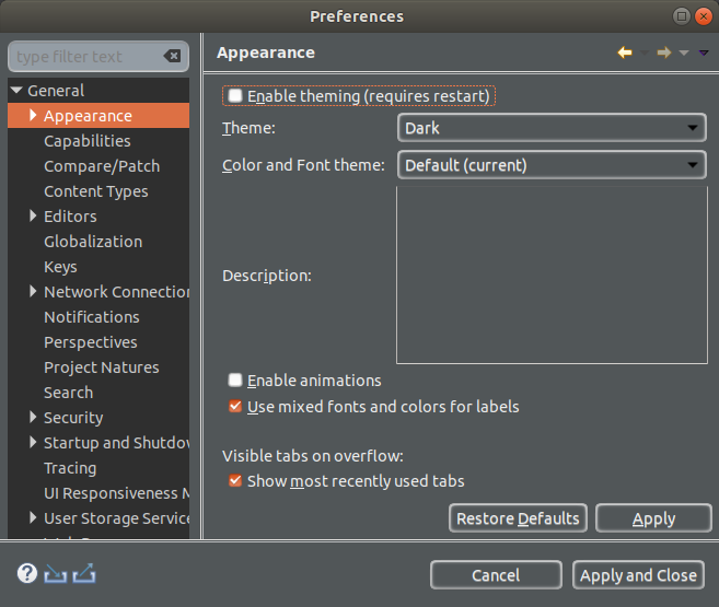
Someone once said, that all the cool kids are using a dark theme these days. If you want to join this club, simply type "Dark" into the Quick Access box and press enter. This brings you to the correct preference page. Select Dark, press Apply and Close (and restart your IDE to fully apply the theme).

Selected Dark theme improvements in 4.8
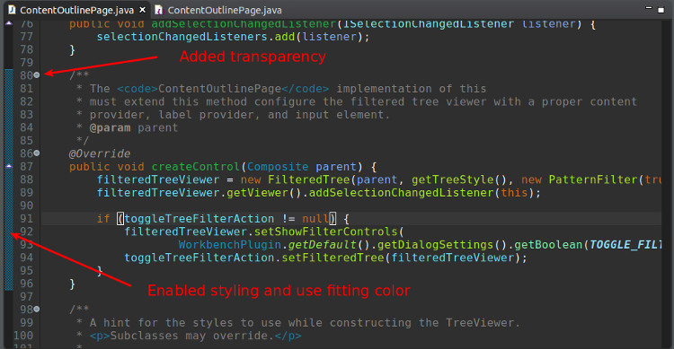
Sometimes the small things do matter. Eclipse 4.8 continues to improve the default text editor. The Eclipse default dark theme now includes styling for the text editor's range indicator and uses transparency for the expand and collapse buttons.
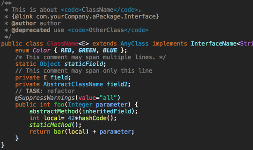
To improve readability in the dark theme, bold style usage has been reduced in the Java editor and some colors that were too close to each other have been altered.
Lots of icons have been adjusted to look better in both the light as well as the dark theme.
For example, the block selection, word wrap and show whitespace icons have been adjusted.
Before:

After:

Popup dialogs, for example the platform's update notification popup, now use a dark background and a light foreground color in the dark theme.

The same work has been done for the Javadoc popup which makes the dialog much easier to read in the dark theme. Support for other languages will most likely pick this up for the next release, e.g., the PHP team is working on this in https://bugs.eclipse.org/bugs/show_bug.cgi?id=534520.

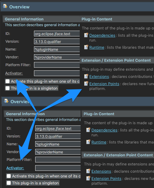
Links now consistently use a light blue color in the dark theme. One example where this was very visible is the PDE's manifest editor.
Improved Tree and Table widget scaling at high DPI on Windows
The colors of links in code element information control now take the color settings of the Hyperlink text color and the Active hyperlink text color from the Colors & Fonts preference page into account. The readability in the dark theme has been improved a lot by this.
Before:

After:

Also multiple extensions like the Gradle tooling for Eclipse have improved their styling.
For example, this is how the Gradle preference page looked before Photon.

This page is nicely styled in the Photon release.
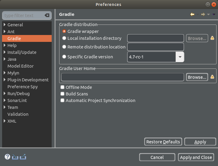
The Gradle tooling initially designed a relatively complex solution to support the dark theme. The final solution is really simple (see https://github.com/eclipse/buildship/pull/688) and the next chapter is designed to help other plug-in developers to apply the same solution for their plug-ins.
Guide for plug-in developers to contribute to the default dark theme
Plug-in developers can easily support the dark theme as any plug-in can contribute to the default dark theme.
To contribute a CSS file to the dark theme, you can write an extension in your plugin.xml similar to the following. The refid="org.eclipse.e4.ui.css.theme.e4_dark" points to the platform dark theme and tells the CSS engine to extend it.
<extension
        point="org.eclipse.e4.ui.css.swt.theme">
    <stylesheet
            uri="css/your_dark_extensions.css">
        <themeid
            refid="org.eclipse.e4.ui.css.theme.e4_dark">
        </themeid>
    </stylesheet>
   </extension>
If you have a custom control, for example MyControl, you can style it for example with the following entry in the "your_dark_extensions.css" file
MyControl {
 background-color:#515658;
 color:#eeeeee;
}
If MyControl is a subclass of Control, the existing CSS handler for Control and the properties background-color and color will call its setForeground and setBackground method on instances of this widget.
As for colors and icons, plug-in developers should avoid hard-coded colors and use png icons with a transparent background to look good in the light as well as in the dark theme.
One way to allow styling of colors is to use preferences or even use the colors and fonts extension point for the platform as described in the following blog post: http://blog.eclipse-tips.com/2008/08/adding-color-and-font-preferences.html
Styling preference via CSS is very simple. Use the IEclipsePreferences#your-preference-node to select the preference node you want to set. Only replace "." with "-" for your preference node. You cannot use “.” as these have a predefined meaning in CSS. The Eclipse CSS engine will convert the underscores to the correct preference node. If styling colors and fonts from the platform extension point, you must also add a pseudo-select (in the following example :org-eclipse-jdt-ui) to avoid overridden CSS preference settings from other plug-ins.
Here is an example from JDT UI for styling its colors, which will contribute to the org.eclipse.ui.workbench preference node.
IEclipsePreferences#org-eclipse-ui-workbench:org-eclipse-jdt-ui { /* pseudo attribute added to allow contributions without replacing this node, see Bug 466075 */
preferences:
     'org.eclipse.jdt.ui.ColoredLabels.inherited=143,143,191'
     'org.eclipse.jdt.ui.Javadoc.backgroundColor=52,57,61'
     'org.eclipse.jdt.ui.Javadoc.foregroundColor=238,238,238'
}
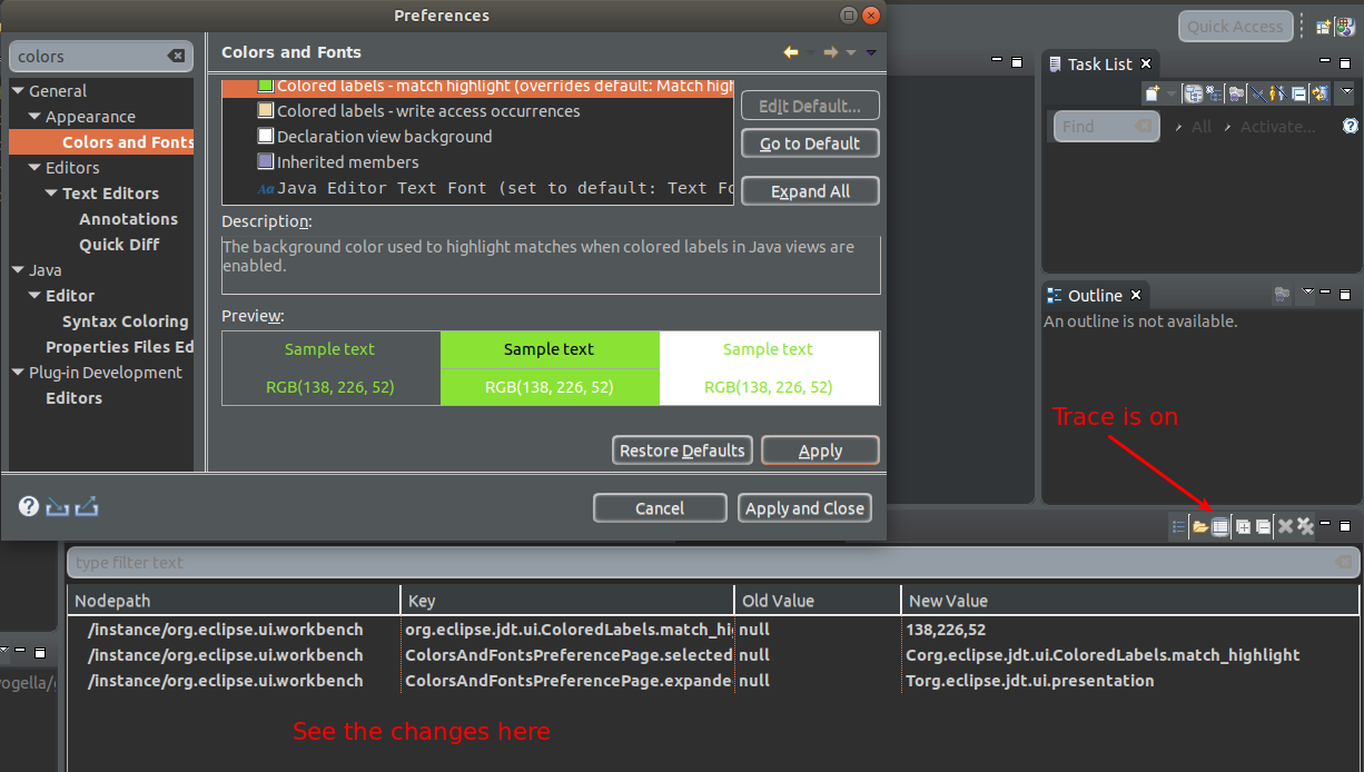
Available tools for CSS work
To analyze or to test CSS snippets you can use the CSS spy and the CSS scratch pad. Install the spies via the following update site: http://download.eclipse.org/e4/snapshots/org.eclipse.e4.tools/latest/
The CSS spy allows the selection of a UI component and show (and sometimes) change their properties.

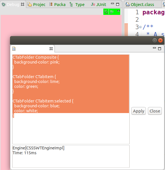
To test CSS snippets use CSS scratchpad, also available on the above update site. For example, open the “CSS Scratchpad” view via the Quick Access and use the following:
CTabFolder Composite {
  background-color: pink;
}

CTabFolder CTabItem {
  background-color: lime;
  color: green;
}

CTabFolder CTabItem:selected {
  background-color: blue;
  color: white;
}
This will style the running IDE similar to the following.
Last but not least, it allows the preference spy to trace changes in the preferences to find the correct preference node and value to style it.
For more information on the spys and the CSS styling see http://www.vogella.com/tutorials/EclipsePlatformDevelopment/article.html#eclipse_ide_spies and http://www.vogella.com/tutorials/Eclipse4CSS/article.html.
Future work
Of course, the platform team continues to work on the dark theme. Most interesting for Windows users is the work in Bug 508634 which would allow users to set the background and foreground color for (read-only) combo-box which are frequently used in the Eclipse IDE. But again lots of small annoyances will be addressed for the next release, which will arrive only 3 months later after the Photon release.
Good news for the dark theme is that several platform developers, including the author of this article, have switched to the dark theme for their daily work. This also means that the remaining issues with the dark theme are more easily discovered and faster fixed.
How can you help as a user?
Tools like Git, Gradle, and Maven for Eclipse already provide good support for the dark theme and we expect that this support will grow in the future, especially now that plug-in developers have a small guide how to support it. Patches to support the dark theme are also relatively simple (plugin.xml registration of the CSS file and a corresponding CSS file).
So if you are a dark theme user, please open bugs for the components which do not yet support the dark theme. Or even better provide a snippet which you validated via the CSS spy or CSS scratch pad so that the plug-in developers can apply it. Also plug-ins which are still using old gifs (which do not support real transparency), will most likely be happy about contributions of svg version of their icons, so that they can generate png and HDPI png files from them.
Conclusion
So hopefully you enjoy the improved dark theme in Eclipse Photon. Like I said earlier, all the cool kids are using a dark theme these days. ;-)
About the Author
