Note: This is about the interaction design API for the workbench, not the theming API that controls the look of specific widgets.
RAP provides an additional API to change the look and feel of workbench applications. This article is a step-by-step guide to using the so-called “interaction design API” to control the look of the WorkbenchWindow. All look and feel artifacts can be bundled into a separate plug-in and contributed to an existing application without touching the application itself.
Let's have a look at a RAP application with a customized look and feel:
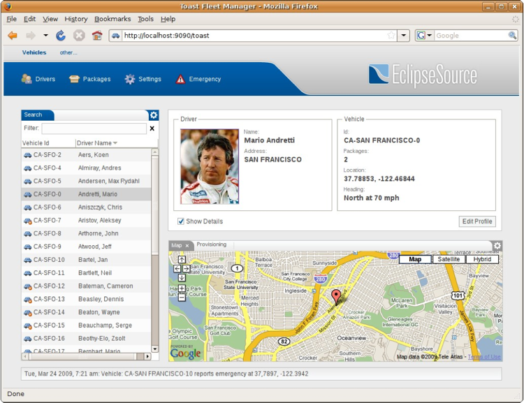
These are the elements that we will be working with.
Finally, one additional but important requirement for a good look and feel is to change interaction concepts to match the new UI. To assist in this, the API provides an automatic service called personalization. For instance it hides all ViewActions by default and makes it's visibility customizable.
The best place to start is to create a PresentationFactory. You will need to create an extension for the org.eclipse.ui.presentationFactories extension point.
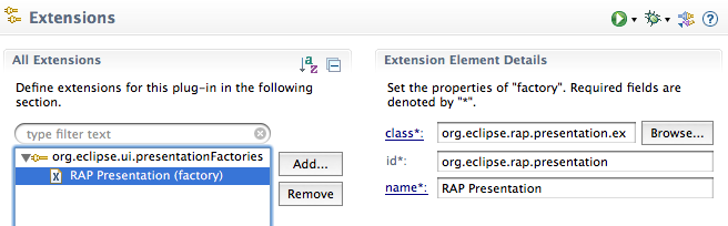
Here is the same as it appears in the plugin.xml.
<extension point="org.eclipse.ui.presentationFactories">
  <factory
    class="org.eclipse.rap.presentation.example.PresentationFactoryImpl"
    id="org.eclipse.rap.presentation"
    name="RAP Presentation">
  </factory>
</extension>
The presentationFactory contains the following attributes:
The org.eclipse.rap.ui.interactiondesign.PresentationFactory is abstract, so you will need to implement its abstract methods. Most are create methods for different Managers, for example, the MenuBar MenuManager or the Manager for the ToolBar. A ToolBar or MenuBar manager is a contribution manager which realizes itself and its items in a control. In these implementations you can change the look of the components such as styling a toolbar with icons and text or making it transparent.
If you are not familiar with the original AbstractPresentationFactory you might
consider reading up on StackPresentations. You'll find a basic overview of the
partstack in the
Inside the Workbench article.
The look and feel of a partstack can be changed using StackPresentations. In the
previous PresentationFactory the presentation had to be implemented
programmatically. The interaction design API allows you to declare
StackPresentations as an extension for the extension point
org.eclipse.rap.ui.stackPresentations.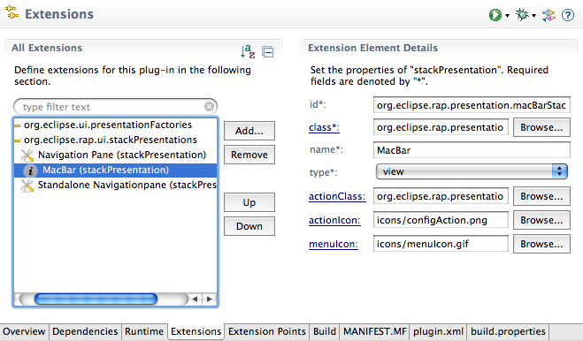
Here is the same as it appears in the plugin.xml.
<extension point="org.eclipse.rap.ui.stackPresentations">
  <stackPresentation
    id="org.eclipse.rap.presentation.macBarStackPresentation"
    class="org.eclipse.rap.presentation.example.stacks.MacBarStackPresentation"
    name="MacBar"
    type="view"
    actionClass="org.eclipse.rap.presentation.example.configaction.ExampleConfigAction"
    actionIcon="icons/configAction.png"
    menuIcon="icons/menuIcon.gif">
  </stackPresentation>
</extension>
stackPresentation contain the following attributes:
RAP provides the ability to define graphical layouts where you have control over
the elements such as the position of the workbench components like the toolbar,
menubar or the perspective switcher. The WorkbenchWindowAdvisors
createWindowContents( Shell ) method is one method, but the
result of this technique is a fixed coupling between the look and feel and your
application code.
You can now separate the application code and the look and feel by using the
org.eclipse.rap.ui.interactiondesign.IWindowComposer Interface. An
implementation of
org.eclipse.rap.ui.interactiondesign.PresentationFactory defines
the method createWindowComposer() which is called within the
WorkbenchWindow. This is a simple replacement for the advisor's method that
results in a loose coupling between application elements.
In order to organize graphical layout information such as images, colors, fonts
and position data, the following registry was created.
org.eclipse.rap.ui.interactiondesign.layout.LayoutRegistry
The LayoutRegistry is a singleton object which contains all existing layouts
represented by org.eclipse.rap.ui.interactiondesign.model.Layout
and org.eclipse.rap.ui.interactiondesign.model.LayoutSet.
A Layout can be declared by creating an extension for the extension point
org.eclipse.rap.ui.layouts.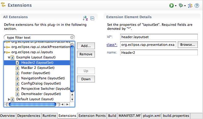
And here is the same as it appears in the plugin.xml.
<extension point="org.eclipse.rap.ui.layouts">
  <layout
    id="org.eclipse.presentation.example.layout"
    name="Example Layout">
      <layoutSet
        class="org.eclipse.rap.presentation.example.layoutset.HeaderLayoutSet2"
        id="header.layoutset"
        name="Header2">
      </layoutSet>
  </layout>
</extension>
Layout contains the following attributes:
Every Layout can have multiple layoutSets:
Element layoutSet
A layoutSet is a representation of the following class:
org.eclipse.rap.ui.interactiondesign.layout.model.LayoutSet. The
object contains the information described above. Every layoutSet has a
maximum of one Layout as a parent and has the following attributes:
The following is an example use case for a declarative layout.
A button should display its text in a specific font. Instead of defining the
font directly in the source code, you can define a layout and a layoutSet over
the extension described above. Let start by creating two id's.
For the Layout = org.eclipse.layout
For the layoutSet = org.eclipse.layoutSet
To define the font you can call the
LayoutSet.addFont( String key, Font font ) method in your
IlayoutSetInitializer implementation. We use "fontKey" as the key value. Here
is the source code for this font definition:
Button button = new Button( composite, SWT.NONE );
LayoutRegistry registry = LayoutRegistry.getInstance();
registry.setActiveLayout( "org.eclipse.layout" );
Layout layout = registry.getActiveLayout();
LayoutSet set = layout.getLayoutSet( "org.eclipse.layoutSet" );
button.setFont( set.getFont( "fontKey" );
An alternative to accomplish this is theming, but the declarative layout give you more options such as defining images or position data. Another big advantage of using the declarative layout is that you can change a layout during runtime. And, to do this is just a two step process.
Different layouts can be activated from a central point by using the servlet name. To activate a PresentationFactory and a Layout by a servlet name, you can use the org.eclipse.rap.ui.branding extension point.
And here is the same as it appears in the plugin.xml.
<extension point="org.eclipse.rap.ui.branding">
<branding
defaultEntrypointId="org.eclipse.rap.demo.entrypoint1"
favicon="icons/perspective.gif"
id="org.eclipse.rap.presentation.macBarBranding"
servletName="api"
themeId="org.eclipse.rap.presentation.macBarTheme"
title="Interactiondesign API">
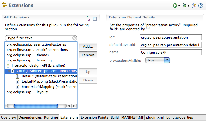
<presentationFactory
defaultLayoutId="org.eclipse.rap.presentation.defaultlayout"
id="org.eclipse.rap.presentation"
name="ConfigurablePF">
viewactionsVisible=true;
<defaultStackPresentation
id="org.eclipse.rap.presentation.navigationPaneStackPresentation"
name="Default">
</defaultStackPresentation>
<stackPresentation
id="org.eclipse.rap.presentation.macBarStackPresentation"
name="topLeftMapping"
partId="topLeft">
</stackPresentation>
</presentationFactory>
</branding>
</extension>
As you can see, the presentationFactory is an element of the branding extension and has the following attributes:
The presentationFactory element can have two different sub elements.
To style the look and feel of a RAP application many web components are also
required. For example, you may want to place the menubar on a header with
rounded corners or place the statusline in a nicely styled footer. You can
accomplish this with SWT Widgets but if you want to reuse these components,
you'll need to use also
org.eclipse.rap.ui.interactiondesign.layout.ElementBuilder. An
ElementBuilder is an abstract class which works hand in hand with the
declarative layout. You can extend it to build your own web components.
This is a two step process.
Composite parent = new Composite( aShell, SWT.NONE );
ElementBuilder builder = new YourBuilder( parent, "org.eclipse.layoutSet" );
Be sure that your ElementBuilder implementation is initialized with a layoutSet you've associated with it.
You may recognize the idea behind the ElementBuilder - it is based on the builder design pattern. This separates the component from your application code allowing you to reuse the component in different places.
This completes our tour of the interaction design API. For questions please feel free to ask in the RAP forum. We'd also be glad to hear about your experiences with this API and to have a look at the great new look and feels you're building for your apps.
 Copyright © 2024 The Eclipse Foundation. All Rights Reserved.

