
| Eclipse Corner Article |
Summary
Populating a table or tree widget involves creating items and setting their attributes (eg.- texts, images, etc.), after which the
table or tree takes responsibility for displaying the items. This approach makes item creation straightforward and visually consistent. As of
Eclipse 3.2, clients of Table and Tree can now custom draw their items, enabling a wide range of potential visual appearances. This article
explores the custom draw mechanism for Table and Tree.
By Grant Gayed, IBM Ottawa Lab
September 15th, 2006 (updated to include SWT.HOT style on June 8, 2007)
Tables and trees are powerful tools for presenting data in a structured manner. Data is displayed as a collection of items which have attributes like text(s), image(s), and sometimes interactive controls such as checkboxes. Typically, clients create the items and set their attributes, after which the table or tree takes responsibility for displaying them. This approach makes item creation straightforward and visually consistent, but is inflexible. For example, an item in a table or tree can only contain one image, and it must appear before its text. Given the range of visual appearances that a client may want an item to have, the best way to ensure that clients can create items with custom appearances is to allow items to be drawn.
The ability to partially or fully custom draw TableItems and TreeItems has been added as of Eclipse 3.2, and will be described in this article. It should be noted that all references made throughout the article to tables can be equally applied to trees, and vice versa.
Custom drawing is done on a per-cell basis, where a cell is the portion of an item that resides within some row and column of the parent table, or the full item if the table has no columns. For example, if a table has two columns and three items then it has six cells.
The following Table events have been defined to provide hooks into the drawing process:
SWT.MeasureItem: allows a client to specify the dimensions of a cells contentSWT.EraseItem: allows a client to custom draw a cells background and/or selection, and to influence whether the cells foreground should be drawnSWT.PaintItem: allows a client to custom draw or augment a cells foreground and/or focus rectangleTo minimize the amount of work required to draw cells, these events are configured to reflect how the cell would be drawn by default. This makes it easy to augment a cells default appearance without having to draw the whole cell. If a client does not hook one of these listeners then the default cell drawing process will occur. The following sections will examine each of these events in detail along with some example code snippets.
SWT.MeasureItem is the first custom draw event that is sent. This event gives a client the opportunity to specify the width and/or height of
a cells content. It is important to note that content size is not necessarily equivalent to cell size, since the latter may include additional decorations
such as checkboxes or tree indentation. Contexts where this event is typically sent include drawing a cell and packing a table column. This event
comes pre-configured with the following fields:
item: the itemindex: the column index of item to be measuredwidth: the default content width that the table would use if it were to draw the cell itself, based on its text, image, and checkboxheight: the default content height that the table would use, based on the height of all of its itemsgc: a GC that is configured with the cells font, which can be useful for performing string measurements
An application that wishes to specify a different content width and/or height for the cell can do so by changing the events width and height
fields. A listener may choose to not change one or both of these values.
Listing 1 (snippet) demonstrates
the use of SWT.MeasureItem to specify custom content dimensions in a table with no columns.
| 1 |
Display display = new Display();
|
| 2 |
Shell shell = new Shell(display);
|
| 3 |
shell.setBounds(10,10,200,250);
|
| 4 |
final Table table = new Table(shell, SWT.NONE);
|
| 5 |
table.setBounds(10,10,150,200);
|
| 6 |
table.setLinesVisible(true);
|
| 7 |
for (int i = 0; i < 5; i++) {
|
| 8 |
new TableItem(table, SWT.NONE).setText("item " + i);
|
| 9 |
}
|
| 10 |
table.addListener(SWT.MeasureItem, new Listener() {
|
| 11 |
public void handleEvent(Event event) {
|
| 12 |
int clientWidth = table.getClientArea().width;
|
| 13 |
event.height = event.gc.getFontMetrics().getHeight() * 2;
|
| 14 |
event.width = clientWidth * 2;
|
| 15 |
}
|
| 16 |
});
|
| 17 |
shell.open();
|
| 18 |
while (!shell.isDisposed()) {
|
| 19 |
if (!display.readAndDispatch()) display.sleep();
|
| 20 |
}
|
| 21 |
display.dispose();
|
Listing 1. Specifying custom widths and heights for items in a table with no columns
Lines 1-3:
Creates a display and shell, and sets the shells bounds.
Lines 4-6:
Creates the table with no columns, sets its bounds, and sets its lines to be visible.
Lines 7-9:
Creates the tables items.
Lines 10-11
Adds an SWT.MeasureItem listener to the table, which will be invoked whenever the size of a cells content is needed.
Line 12:
Gets the tables client width, which will be used when specifying the cell's content width.
Line 13:
Sets the events height field to double the height of the font. This effectively doubles the height of the item in the events item field relative to its
default height.
Line 14:
Sets the events width field to double the width of the table. This specifies that the width of the cell should be this value regardless of its content.
Note that since this table has no columns, the width of the cell is equivalent to that of the full item.
Lines 17 to 21:
Opens the shell, runs the event loop until the shell has been disposed, and disposes the display just before exiting.
Figure 1 shows a screenshot of the snippet in Listing 1 running. Note the increased item heights (caused by line 13), and increased item widths (caused by line 14) which can be inferred from the tables horizontal scrollbar. Figure 2 shows a screenshot of the same snippet running with lines 10 through 16 commented out, allowing the table to draw in its default manner.
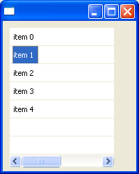
Figure 1. Screenshot of Listing 1 running, which specifies custom widths and heights for the items in a table
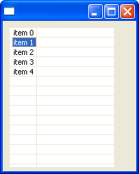
Figure 2. Screenshot of Listing 1 running without the SWT.MeasureItem listener
Note that attempts to change a cells width or height in SWT.MeasureItem events are subject to the following constraints:
SWT.MeasureItem events width field should still
always be set to the cells desired content width because this value will be used if the table has no columns or if its column is being packed.
Listing 2 (snippet) demonstrates the use of SWT.MeasureItem to specify cell widths when a table column is packed.
| 1 |
Display display = new Display();
|
| 2 |
Shell shell = new Shell(display); |
| 3 |
shell.setBounds(10,10,400,200); |
| 4 |
Table table = new Table(shell, SWT.NONE); |
| 5 |
table.setBounds(10,10,350,150); |
| 6 |
table.setHeaderVisible(true); |
| 7 |
table.setLinesVisible(true); |
| 8 |
final TableColumn column0 = new TableColumn(table, SWT.NONE); |
| 9 |
column0.setWidth(100); |
| 10 |
final TableColumn column1 = new TableColumn(table, SWT.NONE); |
| 11 |
column1.setWidth(100); |
| 12 |
column0.addListener(SWT.Selection, new Listener() { |
| 13 |
public void handleEvent(Event event) { |
| 14 |
column0.pack(); |
| 15 |
} |
| 16 |
}); |
| 17 |
column1.addListener(SWT.Selection, new Listener() { |
| 18 |
public void handleEvent(Event event) { |
| 19 |
column1.pack(); |
| 20 |
} |
| 21 |
}); |
| 22 |
for (int i = 0; i < 5; i++) { |
| 23 |
TableItem item = new TableItem(table, SWT.NONE); |
| 24 |
item.setText(0, "item " + i + " col 0"); |
| 25 |
item.setText(1, "item " + i + " col 1"); |
| 26 |
} |
| 27 |
table.addListener(SWT.MeasureItem, new Listener() { |
| 28 |
public void handleEvent(Event event) { |
| 29 |
event.width *= 2; |
| 30 |
} |
| 31 |
}); |
| 32 |
shell.open(); |
| 33 |
while (!shell.isDisposed()) { |
| 34 |
if (!display.readAndDispatch()) display.sleep(); |
| 35 |
} |
| 36 |
display.dispose(); |
Listing 2. Specifying custom cell content widths that are used by TableColumn.pack() to size a column
Lines 1-3:
Creates a display and shell, and sets the shells bounds.
Lines 4-7:
Creates the table, sets its bounds, and sets its header and lines to be visible.
Lines 8-11:
Creates two table columns and sets the initial width of each to 100 pixels.
Lines 12-21:
Adds an SWT.Selection listener to each of the tables columns. These listeners will invoke pack() on the column whenever its header is clicked by the user.
Lines 22-26:
Creates the tables items.
Lines 27-28:
Adds an SWT.MeasureItem listener to the table, which will be invoked whenever the size of a cells content is needed.
Line 29:
Sets the events width field to double the default width of the cell. This specifies that the width of the cell should be this value regardless of its content.
Lines 32-36:
Opens the shell, runs the event loop until the shell has been disposed, and disposes the display just before exiting.
Figure 3 shows a screenshot of the snippet in Listing 2 running after each of the tables columns have been packed by clicking on their headers. Note that
the columns have been packed to a width that is double of what is needed as a result of the SWT.MeasureItem listener in line 29. Figure 4 shows a screenshot
of the same snippet running with lines 27 through 31 commented out, which leaves the tables columns to pack to their default widths.
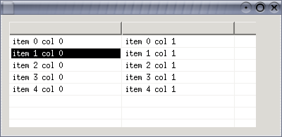
Figure 3. Screenshot of Listing 2 running after the tables columns have been packed using the cell content sizes specified in the SWT.MeasureItem listener
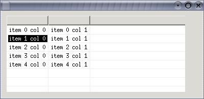
Figure 4. Screenshot of Listing 2 running after the tables columns have been packed using the default cell sizes
SWT.EraseItem is sent just before the background of a cell is about to be drawn. The background consists of the cells background color or the selection background
if the item is selected. This event allows a client to custom draw one or both of these. Also, this event allows the client to indicate whether the cells default
foreground should be drawn following the drawing of the background.
When this event is received the cell has been filled with either the tables background color or the portion of its background image that intersects with the cell. This event comes pre-configured with the following fields:
item: the item
index: the column index of item being drawn
x, y: the table-relative co-ordinates of the top-left corner of the cell
width, height: the width and height of the full cell, or the content width of the cell if the table has no columns; if these values were previously set by
an SWT.MeasureItem listener then they are the same here
gc: the GC configured with the default foreground, background, font and clipping for the cell
detail: the logical OR of one or more of the following bits, indicating what will be drawn by default:
SWT.FOREGROUND: this bit will be set if the default cell foreground will be drawn once the background has been drawn (default is true)
SWT.BACKGROUND: this bit will be set if either a cell-specific or item-specific background color will be drawn for this cell (ie.- a color has previously been
set with either TableItem.setBackground(Color) or TableItem.setBackground(int, Color))
SWT.SELECTED: this bit will be set if the selection will be drawn for this cell, implying that this item is selected
SWT.FOCUSED: this bit will be set if the focus rectangle will be drawn for this cell, implying that this item is the focus item in the table
SWT.HOT: (@since 3.3) this bit will be set if the mouse hover background will be drawn for this cell (not all platforms draw this)
doit: this boolean indicates whether the table will do the drawing specified in the detail field once this listener has completed (default is true)
The listener is responsible for modifying the event to specify the elements that will be custom drawn (if any), and then doing the work. This is done by
clearing certain bits in the detail field, or by setting the doit field to false to indicate that the listener will do all drawing for the cell (usually
in combination with an SWT.PaintItem listener).
Listing 3 (snippet) demonstrates the use of SWT.EraseItem to custom draw the item selection rectangle in a table.
| 1 |
Display display = new Display();
|
| 2 |
Shell shell = new Shell(display); |
| 3 |
final Color red = display.getSystemColor(SWT.COLOR_RED); |
| 4 |
final Color yellow = display.getSystemColor(SWT.COLOR_YELLOW); |
| 5 |
final Table table = new Table(shell, SWT.FULL_SELECTION); |
| 6 |
table.setHeaderVisible(true); |
| 7 |
new TableColumn(table, SWT.NONE).setWidth(100); |
| 8 |
new TableColumn(table, SWT.NONE).setWidth(100); |
| 9 |
new TableColumn(table, SWT.NONE).setWidth(100); |
| 10 |
for (int i = 0; i < 5; i++) { |
| 11 |
TableItem item = new TableItem(table, SWT.NONE); |
| 12 |
item.setText(0, "item " + i + " col 0"); |
| 13 |
item.setText(1, "item " + i + " col 1"); |
| 14 |
item.setText(2, "item " + i + " col 2"); |
| 15 |
} |
| 16 |
table.pack(); |
| 17 |
table.addListener(SWT.EraseItem, new Listener() { |
| 18 |
public void handleEvent(Event event) { |
| 19 |
event.detail &= ~SWT.HOT; |
| 20 |
if ((event.detail & SWT.SELECTED) == 0) return; /* item not selected */ |
| 21 |
int clientWidth = table.getClientArea().width; |
| 22 |
GC gc = event.gc; |
| 23 |
Color oldForeground = gc.getForeground(); |
| 24 |
Color oldBackground = gc.getBackground(); |
| 25 |
gc.setForeground(red); |
| 26 |
gc.setBackground(yellow); |
| 27 |
gc.fillGradientRectangle(0, event.y, clientWidth, event.height, false); |
| 28 |
gc.setForeground(oldForeground); |
| 29 |
gc.setBackground(oldBackground); |
| 30 |
event.detail &= ~SWT.SELECTED; |
| 31 |
} |
| 32 |
}); |
| 33 |
shell.pack(); |
| 34 |
shell.open(); |
| 35 |
while (!shell.isDisposed()) { |
| 36 |
if (!display.readAndDispatch()) display.sleep(); |
| 37 |
} |
| 38 |
display.dispose(); |
Listing 3: Custom drawing item selection
Lines 1-2:
Creates a display and shell.
Lines 3-4:
Obtains the systems red and yellow colors, which will be used for drawing the custom selection.
Lines 5-6:
Creates the table and sets its header to be visible. The tables style is specified to be SWT.FULL_SELECTION since the custom-drawn selection will span
the full table width.
Lines 7-9:
Creates three table columns and sets the initial width of each to 100 pixels.
Lines 10-15:
Creates the tables items.
Line 16:
Packs the table to its preferred size.
Lines 17-18:
Adds an SWT.EraseItem listener to the table, which will be invoked whenever the background of a cell is about to be drawn.
Line 19:
Clears the SWT.HOT bit from the events detail field to ensure that hover backgrounds are not natively drawn.
Line 20:
Checks the detail field for the SWT.SELECTED bit, and returns out of the listener if it is not there since there is no selection to draw.
Line 21:
Gets the tables client width, to be used for drawing the cell's selection.
Lines 22-24:
Obtains the GC to draw on from the event and stores its foreground and background colors for the purpose of restoring them later.
Lines 25-27:
Draws the custom selection rectangle using a gradient that spans from red to yellow. Line 26 specifies the full width of the item as the gradient bounds
so that the color range will span the table width properly. Since the GCs clipping is pre-configured to the bounds of the cell, only this portion of this
gradient drawing will appear.
Lines 28-29:
Restores the GCs foreground and background colors to their previous values.
Line 30:
Clears the SWT.SELECTED bit from the events detail field to indicate that the default selection should not be drawn for this cell. Note that this item is
still considered to be logically selected in the table.
Lines 33-38:
Packs and opens the shell, runs the event loop until the shell has been disposed, and disposes the display just before exiting.
Figure 5 shows a screenshot of the snippet in Listing 3 running. Though the selection gradient appears to be one continuous rectangle, it is actually drawn three times, each clipped to its respective cell.
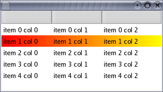
Figure 5. Screenshot of Listing 3 running, which uses an SWT.EraseItem listener to draw a custom selection
Listing 4 (snippet) demonstrates the use of
SWT.EraseItem to custom draw cell backgrounds in a table with no columns. This example modifies the default clipping of the GC to display gradient rectangles that
represent temperature ranges.
| 1 |
final String[] MONTHS = {
|
| 2 |
"Jan", "Feb", "Mar", "Apr", "May", "Jun", |
| 3 |
"Jul", "Aug", "Sep", "Oct", "Nov", "Dec" |
| 4 |
} |
| 5 |
final int[] HIGHS = {-7, -4, 1, 11, 18, 24, 26, 25, 20, 13, 5, -4}; |
| 6 |
final int[] LOWS = {-15, -13, -7, 1, 7, 13, 15, 14, 10, 4, -2, -11}; |
| 7 |
final int SCALE_MIN = -30; final int SCALE_MAX = 30; |
| 8 |
final int SCALE_RANGE = Math.abs(SCALE_MIN - SCALE_MAX); |
| 9 |
Display display = new Display(); |
| 10 |
Shell shell = new Shell(display); |
| 11 |
shell.setBounds(10,10,400,350); |
| 12 |
shell.setText("Ottawa Average Daily Temperature Ranges"); |
| 13 |
final Color blue = display.getSystemColor(SWT.COLOR_BLUE); |
| 14 |
final Color white = display.getSystemColor(SWT.COLOR_WHITE); |
| 15 |
final Color red = display.getSystemColor(SWT.COLOR_RED); |
| 16 |
final Image parliamentImage = new Image(display, "./parliament.jpg"); |
| 17 |
final Table table = new Table(shell, SWT.NONE); |
| 18 |
table.setBounds(10,10,350,300); |
| 19 |
table.setBackgroundImage(parliamentImage); |
| 20 |
for (int i = 0; i < 12; i++) { |
| 21 |
TableItem item = new TableItem(table, SWT.NONE); |
| 22 |
item.setText(MONTHS[i] + " (" + LOWS[i] + "C..." + HIGHS[i] + "C)"); |
| 23 |
} |
| 24 |
final int clientWidth = table.getClientArea().width; |
| 25 |
table.addListener(SWT.MeasureItem, new Listener() { |
| 26 |
public void handleEvent(Event event) { |
| 27 |
int itemIndex = table.indexOf((TableItem)event.item); |
| 28 |
int rightX = (HIGHS[itemIndex] - SCALE_MIN) * clientWidth / SCALE_RANGE; |
| 29 |
event.width = rightX; |
| 30 |
} |
| 31 |
}); |
| 32 |
table.addListener(SWT.EraseItem, new Listener() { |
| 33 |
public void handleEvent(Event event) { |
| 34 |
int itemIndex = table.indexOf((TableItem)event.item); |
| 35 |
int leftX = (LOWS[itemIndex] - SCALE_MIN) * clientWidth / SCALE_RANGE; |
| 36 |
int rightX = (HIGHS[itemIndex] - SCALE_MIN) * clientWidth / SCALE_RANGE; |
| 37 |
GC gc = event.gc; |
| 38 |
Rectangle clipping = gc.getClipping(); |
| 39 |
clipping.x = leftX; |
| 40 |
clipping.width = rightX - leftX; |
| 41 |
gc.setClipping(clipping); |
| 42 |
Color oldForeground = gc.getForeground(); |
| 43 |
Color oldBackground = gc.getBackground(); |
| 44 |
gc.setForeground(blue); |
| 45 |
gc.setBackground(white); |
| 46 |
gc.fillGradientRectangle( |
| 47 |
gc.setForeground(white); |
| 48 |
gc.setBackground(red); |
| 49 |
gc.fillGradientRectangle( |
| 50 |
gc.setForeground(oldForeground); |
| 51 |
gc.setBackground(oldBackground); |
| 52 |
event.detail &= ~SWT.BACKGROUND; |
| 53 |
event.detail &= ~SWT.HOT; |
| 54 |
} |
| 55 |
}); |
| 56 |
shell.open(); |
| 57 |
while (!shell.isDisposed()) { |
| 58 |
if (!display.readAndDispatch()) display.sleep(); |
| 59 |
} |
| 60 |
parliamentImage.dispose(); |
| 61 |
display.dispose(); |
Listing 4. Custom drawing item backgrounds
Lines 1-8:
Defines constants that will be used to set the tables item data and to draw item backgrounds.
Lines 9-12:
Creates a display and shell, and sets the shells bounds and title.
Lines 13-15:
Obtains the systems blue, white and red colors, which will be used for drawing item backgrounds.
Line 16:
Loads an image that will be set into the table as the background.
Lines 17-18:
Creates the table with no columns and sets its bounds.
Line 19:
Sets the background image into the table.
Lines 20-23:
Creates the tables items.
Line 24:
Stores the tables client width for later use when drawing the item backgrounds.
Lines 25-26:
Adds an SWT.MeasureItem listener to the table so that item sizes can be specified.
Lines 27-29:
Computes the right bound of the item in the events item field and sets this value into the events width field.
Lines 32-33:
Adds an SWT.EraseItem listener to the table so that item backgrounds can be custom drawn.
Lines 34-36:
Gets the item from the events item field and computes the left and right bounds that its temperature bar should be drawn with.
Lines 37-41:
Updates the clipping of the GC in the events gc field to the bounds that were computed for this items temperature bar.
Lines 42-43:
Stores the GCs foreground and background colors for the purpose of restoring them later.
Lines 44-46:
Draws the left half of the custom background rectangle with a gradient that spans from blue to white. The portion of this rectangle that
intersects with the GCs clipping bounds that were set in line 41 will ultimately appear.
Lines 47-49:
Draws the right half of the custom background rectangle with a gradient that spans from white to red. The portion of this rectangle that
intersects with the GCs clipping bounds that were set in line 41 will ultimately appear.
Lines 50-51:
Restores the GCs foreground and background colors to their previous values.
Line 52:
Clears the SWT.BACKGROUND bit from the events detail field to indicate that the default background should not be drawn for this cell.
Line 53:
Clears the SWT.HOT bit from the events detail field to ensure that hover backgrounds are not natively drawn.
Lines 56-61:
Opens the shell, runs the event loop until the shell has been disposed, and disposes the background image and display just before exiting.
Figure 6 shows a screenshot of the snippet in listing 4 running.

Figure 6. Screenshot of Listing 4 running, which uses an SWT.EraseItem listener to draw custom item backgrounds
SWT.PaintItem is sent for a cell just after its default foreground contents have been drawn. This event allows a client to augment the
cell, or to completely draw the cells content. This event always comes pre-configured with the following fields:
item: the item
index: the column index of item being drawn
x, y: the table-relative co-ordinates of the top-left corner of the cells content (ie.- its image or text)
width, height: the width and height of the cells content; if these values were previously set by an SWT.MeasureItem listener then they
are the same here
gc: the GC configured with the default foreground, background, font and clipping for the cell
detail: the logical OR of zero or more of the following bits:
SWT.SELECTED: this bit will be set if the item is selected
SWT.FOCUSED: this bit will be set if the item is the tables focus item
SWT.HOT: (@since 3.3) this bit will be set if the mouse hover background will be drawn for this cell (not all platforms draw this)
The purpose of the x and y fields are to indicate the location for custom drawing. These values take into account decorations such as checkboxes and
tree indentation.
Listing 5 (snippet) demonstrates the use of
SWT.PaintItem to augment the default drawing of tree items. It uses the x, y and width fields in the SWT.PaintItem
event to draw an image to the right of alternating items. This is an example of a simple drawing enhancement that enriches an items default content while still maintaining its
native appearance.
| 1 |
Display display = new Display();
|
| 2 |
Shell shell = new Shell(display); |
| 3 |
shell.setBounds(10, 10, 350, 200); |
| 4 |
Image xImage = new Image (display, 16, 16); |
| 5 |
GC gc = new GC(xImage); |
| 6 |
gc.setForeground(display.getSystemColor(SWT.COLOR_RED)); |
| 7 |
gc.drawLine(1, 1, 14, 14); |
| 8 |
gc.drawLine(1, 14, 14, 1); |
| 9 |
gc.drawOval(2, 2, 11, 11); |
| 10 |
gc.dispose(); |
| 11 |
final int IMAGE_MARGIN = 2; |
| 12 |
final Tree tree = new Tree(shell, SWT.CHECK); |
| 13 |
tree.setBounds(10, 10, 300, 150); |
| 14 |
TreeItem item = new TreeItem(tree, SWT.NONE); |
| 15 |
item.setText("root item"); |
| 16 |
for (int i = 0; i < 4; i++) { |
| 17 |
TreeItem newItem = new TreeItem(item, SWT.NONE); |
| 18 |
newItem.setText("descendent " + i); |
| 19 |
if (i % 2 == 0) newItem.setData(xImage); |
| 20 |
item.setExpanded(true); |
| 21 |
item = newItem; |
| 22 |
} |
| 23 |
tree.addListener(SWT.MeasureItem, new Listener() { |
| 24 |
public void handleEvent(Event event) { |
| 25 |
TreeItem item = (TreeItem)event.item; |
| 26 |
Image trailingImage = (Image)item.getData(); |
| 27 |
if (trailingImage != null) { |
| 28 |
event.width += trailingImage.getBounds().width + IMAGE_MARGIN; |
| 29 |
} |
| 30 |
} |
| 31 |
}); |
| 32 |
tree.addListener(SWT.PaintItem, new Listener() { |
| 33 |
public void handleEvent(Event event) { |
| 34 |
TreeItem item = (TreeItem)event.item; |
| 35 |
Image trailingImage = (Image)item.getData(); |
| 36 |
if (trailingImage != null) { |
| 37 |
int x = event.x + event.width + IMAGE_MARGIN; |
| 38 |
int itemHeight = tree.getItemHeight(); |
| 39 |
int imageHeight = trailingImage.getBounds().height; |
| 40 |
int y = event.y + (itemHeight - imageHeight) / 2; |
| 41 |
event.gc.drawImage(trailingImage, x, y); |
| 42 |
} |
| 43 |
} |
| 44 |
}); |
| 45 |
shell.open(); |
| 46 |
while (!shell.isDisposed()) { |
| 47 |
if (!display.readAndDispatch()) display.sleep(); |
| 48 |
} |
| 49 |
xImage.dispose(); |
| 50 |
display.dispose(); |
Listing 5. Using SWT.PaintItem to augment the default drawing of items
Lines 1-3:
Creates a display and shell, and sets the shells bounds.
Lines 4-11:
Creates the image that will be used in this example, and defines a constant that will be used when drawing item foregrounds.
Lines 12-13:
Creates the tree with no columns and sets its bounds.
Lines 14-22:
Creates the trees items. Note that line 19 sets the trailing image as the item data for alternating items. This data will be used when custom drawing the item foregrounds.
Lines 23-24:
Adds an SWT.MeasureItem listener to the tree so that item sizes can be specified.
Lines 25-29:
Gets the item from the events item field, and if it has a trailing image, updates the events width field to include space for the items default
content plus the trailing image.
Lines 32-33:
Adds an SWT.PaintItem listener to the tree so that the default foreground can be augmented.
Lines 34-42:
Gets the tree item from the events item field, and if it has a trailing image set, draws the image to the right of the items text.
The events x, y and width fields are used to compute the position of the image.
Lines 45-50:
Opens the shell, runs the event loop until the shell has been disposed, and disposes the images and display just before exiting.
Figure 7 shows a screenshot of the snippet in listing 5 running. It has the appearance of a native tree but also includes trailing images.
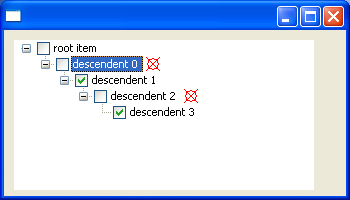
Figure 7. Screenshot of Listing 5 running, which uses an SWT.PaintItem listener to augment the default drawing of items in a tree
Listing 6 (snippet) demonstrates the use of
SWT.PaintItem to draw items with multiple lines of text, which is not currently supported in tables. It clears the SWT.FOREGROUND bit from the
detail field in the SWT.EraseItem event, and then draws the text in the SWT.PaintItem event.
| 1 |
final int COLUMN_COUNT = 4;
|
| 2 |
final int ITEM_COUNT = 8; |
| 3 |
final int TEXT_MARGIN = 3; |
| 4 |
Display display = new Display(); |
| 5 |
Shell shell = new Shell(display); |
| 6 |
final Table table = new Table(shell, SWT.FULL_SELECTION); |
| 7 |
table.setHeaderVisible(true); |
| 8 |
table.setLinesVisible(true); |
| 9 |
for (int i = 0; i < COLUMN_COUNT; i++) { |
| 10 |
new TableColumn(table, SWT.NONE); |
| 11 |
} |
| 12 |
for (int i = 0; i < ITEM_COUNT; i++) { |
| 13 |
TableItem item = new TableItem(table, SWT.NONE); |
| 14 |
for (int j = 0; j < COLUMN_COUNT; j++) { |
| 15 |
String string = "item " + i + " col " + j; |
| 16 |
if ((i + j) % 3 == 1) { |
| 17 |
string +="\nnew line1"; |
| 18 |
} |
| 19 |
if ((i + j) % 3 == 2) { |
| 20 |
string +="\nnew line1\nnew line2"; |
| 21 |
} |
| 22 |
item.setText(j, string); |
| 23 |
} |
| 24 |
} |
| 25 |
table.addListener(SWT.MeasureItem, new Listener() { |
| 26 |
public void handleEvent(Event event) { |
| 27 |
TableItem item = (TableItem)event.item; |
| 28 |
String text = item.getText(event.index); |
| 29 |
Point size = event.gc.textExtent(text); |
| 30 |
event.width = size.x + 2 * TEXT_MARGIN; |
| 31 |
event.height = Math.max(event.height, size.y + TEXT_MARGIN); |
| 32 |
} |
| 33 |
}); |
| 34 |
table.addListener(SWT.EraseItem, new Listener() { |
| 35 |
public void handleEvent(Event event) { |
| 36 |
event.detail &= ~SWT.FOREGROUND; |
| 37 |
} |
| 38 |
}); |
| 39 |
table.addListener(SWT.PaintItem, new Listener() { |
| 40 |
public void handleEvent(Event event) { |
| 41 |
TableItem item = (TableItem)event.item; |
| 42 |
String text = item.getText(event.index); |
| 43 |
/* center column 1 vertically */ |
| 44 |
int yOffset = 0; |
| 45 |
if (event.index == 1) { |
| 46 |
Point size = event.gc.textExtent(text); |
| 47 |
yOffset = Math.max(0, (event.height - size.y) / 2); |
| 48 |
} |
| 49 |
event.gc.drawText(text, event.x + TEXT_MARGIN, event.y + yOffset, true); |
| 50 |
} |
| 51 |
}); |
| 52 |
for (int i = 0; i < COLUMN_COUNT; i++) { |
| 53 |
table.getColumn(i).pack(); |
| 54 |
} |
| 55 |
table.pack(); |
| 56 |
shell.pack(); |
| 57 |
shell.open(); |
| 58 |
while (!shell.isDisposed()) { |
| 59 |
if (!display.readAndDispatch()) display.sleep(); |
| 60 |
} |
| 61 |
display.dispose(); |
Listing 6. Using SWT.PaintItem to draw items with multiple lines of text
Lines 1-3:
Defines constants that will be used for creating and drawing the tables items.
Lines 4-5:
Creates a display and shell.
Lines 6-8:
Creates the table and sets its header and lines to be visible.
Lines 9-11:
Creates the tables columns.
Lines 12-24:
Creates the tables items. Item texts are set to values with one, two, or three lines of text.
Lines 25-26:
Adds an SWT.MeasureItem listener to the table so that item sizes can be specified.
Lines 27-31:
Gets the item and column index from the event, computes the bounds of its text, and uses this value to set the events width and height fields. TEXT_MARGIN is added
to the bounds to create space for a small margin around the items content.
Lines 34-38:
Adds an SWT.EraseItem listener to the table for the purpose of clearing the SWT.FOREGROUND bit from the events detail field. This indicates that the default drawing
of item foregrounds should not occur because the SWT.PaintItem listener will do this in full.
Lines 39-40:
Adds an SWT.PaintItem listener to the table so that item foregrounds can be custom drawn.
Lines 41-49:
Gets the text for the cell and draws it. The text is centered vertically within the cell for column 1, and draws top-aligned otherwise.
Lines 52-54:
Packs the tables columns to their preferred widths, using the values provided by the SWT.MeasureItem listener.
Lines 55-56:
Packs the table and shell to their preferred sizes.
Lines 57-61:
Opens the shell, runs the event loop until the shell has been disposed, and disposes the display just before exiting.
Figure 8 shows a screenshot of the snippet in Listing 6 running.
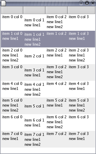
Figure 8. Screenshot of Listing 6 running, which uses an SWT.PaintItem listener to custom draw the tables items
With Table and Tree custom draw facilities in place, items can appear native, custom-drawn, or somewhere in between. With a small amount of effort, clients can use this flexibility to display data any way that they want. The potential uses for custom item drawing extend beyond the examples presented in this article. To view a growing collection of examples that use custom draw tables and trees see http://www.eclipse.org/swt/snippets/#table and http://www.eclipse.org/swt/snippets/#tree.
Errata and comments about this article can be reported in https://bugs.eclipse.org/bugs/show_bug.cgi?id=157330.
Java and all Java-based trademarks and logos are trademarks or registered trademarks of Sun Microsystems, Inc. in the United States, other countries, or both.
IBM is a registered trademark of International Business Machines Corporation in the United States, other countries, or both.
Other company, product, or service names may be trademarks or service marks of others.